STANDARD BIO
Returning farming to a circular economy
Strategy, Identity, Content Development, Website, Animation
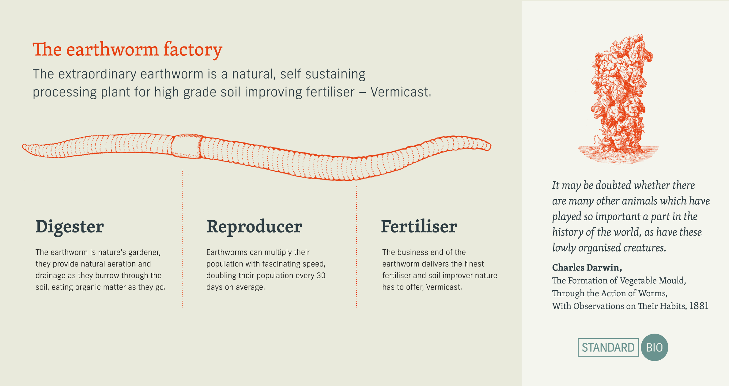
Delivering a sustainable, soil improving fertiliser, from an environmentally sound process is an exciting discovery. Standard Bio believe they have it and, the more you learn about the humble and extraordinary earthworm, we think you will agree.


Finding better ways to work with nature
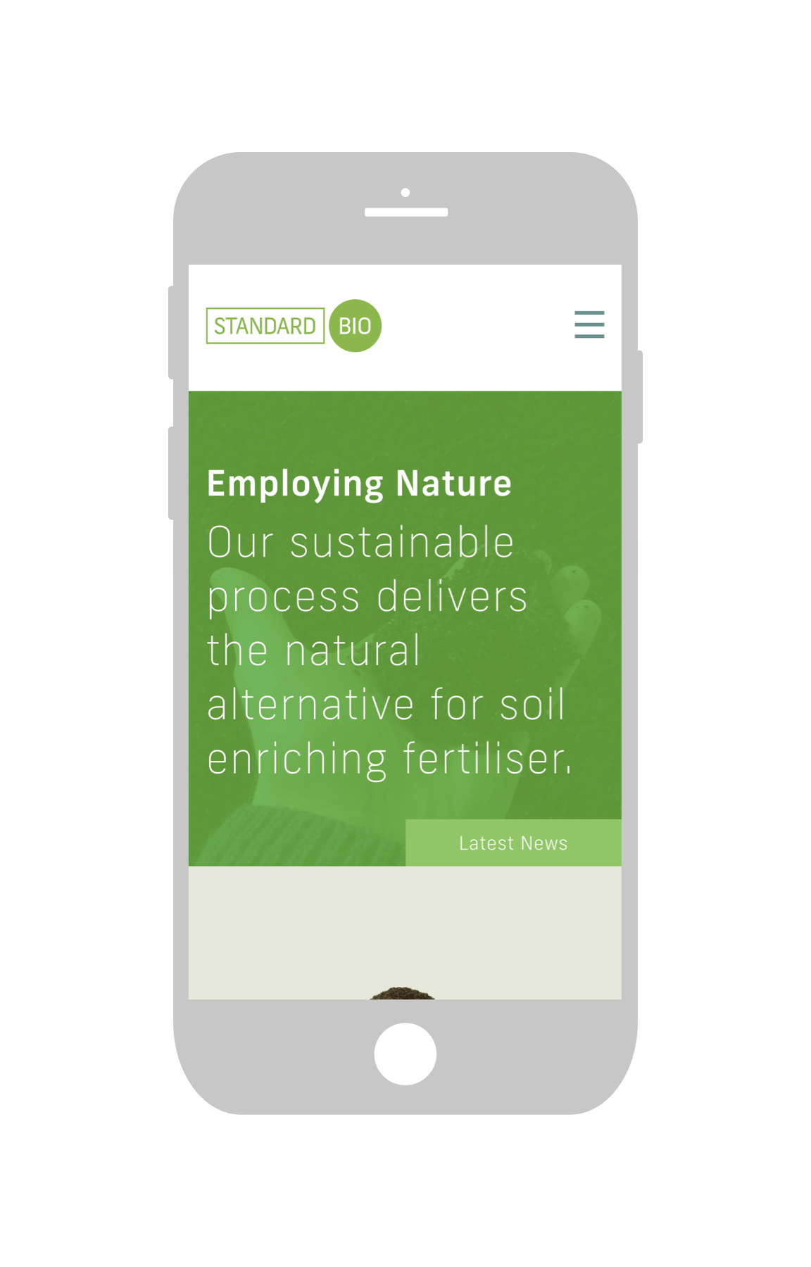
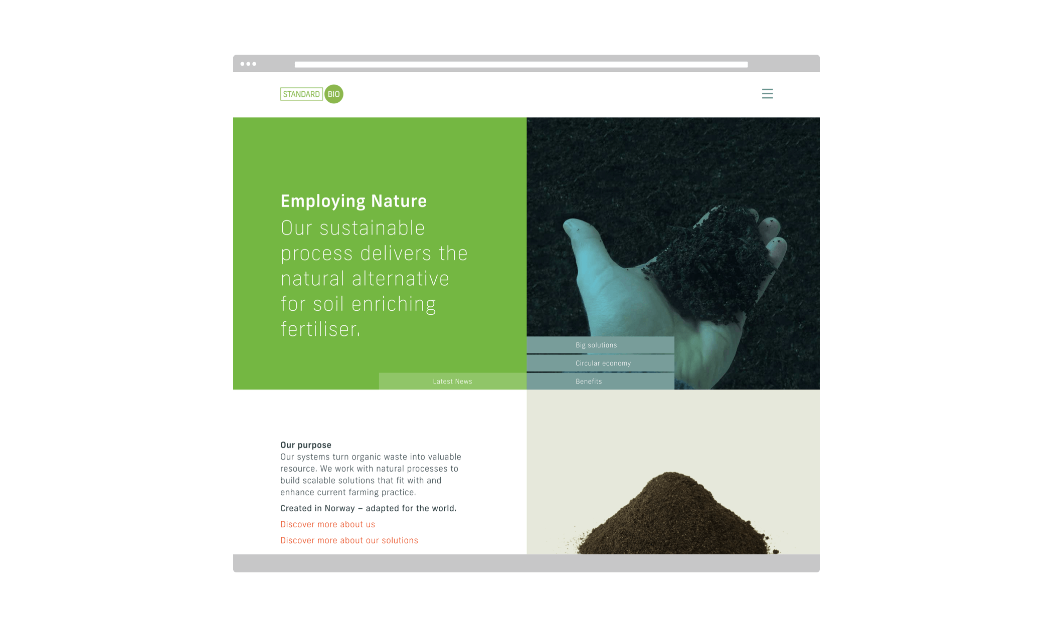
We have partnered with Standard Bio to define and implement the strategy for bringing this new product, and process, to a global market. Created in Norway – adapted for the world.
There are many aspects of the story to tell; how innovation can redefine industry, how the circular economy can turn waste into resource, how a transparent approach to business can empower customers.
The core concept we have identified in Standard Bio [standardising biology] is its place between nature and industry. In its simplest logo form this difference is presented by the natural circle and the angular box. The juxtaposition of hand drawn organic circles and geometric rectangles allows for the multiple combinations and applications this brand will need to move from retail garden centre, to academic study and agricultural functionality. To accommodate the necessary tones of voice we have chosen two typefaces; a bold, hard working sans serif – TP Frank, and an educated lyrical serif – Skolar PE.
Currently Standard Bio are successfully targeting investors. A product range is under development for late 2016.